
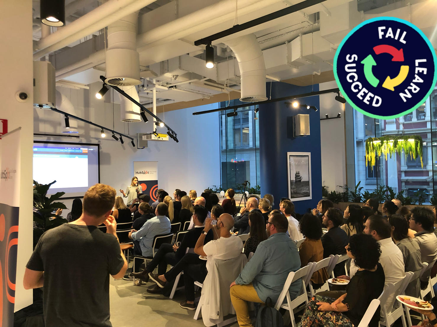
Recently I was a presenter at the Sydney HubSpot User Group where it was my task to deliver my favourite HubSpot tip in 5 minutes or less. Something that had proven results and was actionable for the audience. Got it.. No fluffy, hypothetical best practices, just down and dirty real world examples - my favourites.
Considering the audience typically consists of both experienced HubSpot users, some still thinking about it and partners, I decided to focus on the challenge of growing your newsletter list and/or blog subscribers. It’s not as easy as it once used to be, however there are a few simple adjustments that can be made inside HubSpot to kick it up a level.
So, here goes
Problem
The problem I’m covering today is the painfully slow growth of newsletter or blog subscriber lists. This insight is based on work that I’ve done with a client who had loads of traffic but very low conversions.
So, you’ve got a website, with a form on it for people to sign up for your blog or newsletter. However, the growth of this list just hasn’t happened, despite loads of traffic.
These traditional newsletter subscribe forms that are visible on a website – like this one - are pretty ubiquitous.
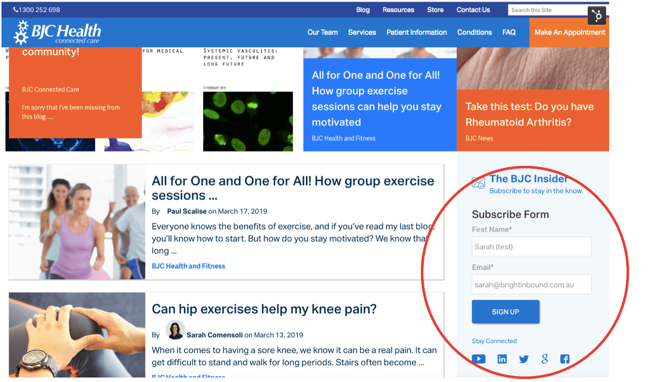
They’re either on the side of a blog or at the bottom of each page and unfortunately do not convert very well, if at all. From my experience, these type of forms fall prey to banner blindness. They get ignored by most visitors because they treat them as advertisements.
So what should you do instead? Here are the results from the experiments that we tried to solve this problem.
What Didn’t Work
First we tried a button to click to subscribe.
This follows the logic that people who actively click are more likely to subscribe. This logic is solid, however in my experience this also fell prey to banner blindness and was just too subtle.
So we tried the less subtle approach. How about a pop-up window over the content that the website visitor was reading. This trial was abandoned very early on, when we realised that, not only was it not working, but it was providing a very frustrating customer experience.
We quickly realised that you need to provide value first which leads to trust, trust leads to relationships and relationships lead to revenue.
With both of these options in play the subscriber list grew VERY slowly. At best 1 new subscriber per month. Eeek! Not a great result. So where to next?
What Worked?
So realigning our thinking to provide value first and to also take baby steps with our website visitors we did two things that significantly increased the number of newsletter subscribers.
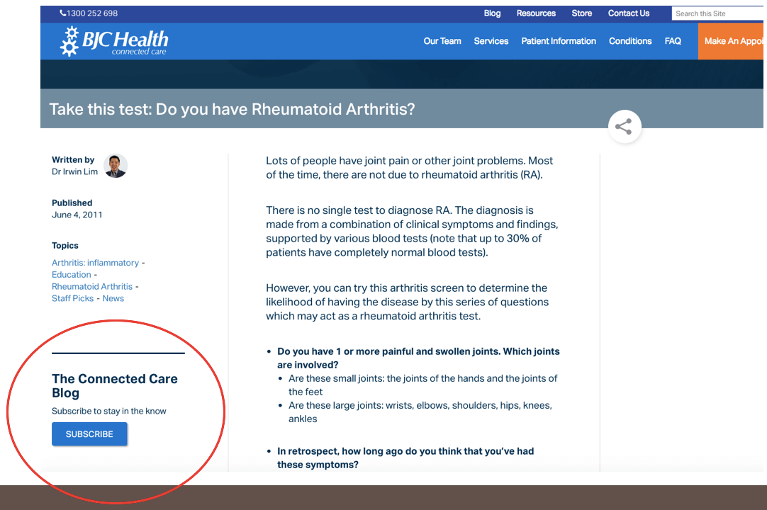
The Add-On Offer
For this tactic we looked at which landing pages and pieces of content were already converting well and were popular with our audience.
On these existing forms we created a simple, single checkbox that asked people if they’d like to subscribe to the newsletter.
This works in a similar way to a McDonalds up-sell… do you want fries with that? People are already completing your form to access your valuable content asset. Simply adding a check-box to add them to your newsletter list is a no brainer, as they’re already inclined towards completing the form. However, please make sure that you don’t have the check box automatically checked on.. that’s a permission No No.
The Baby Step
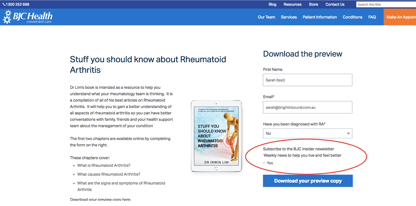
The next thing we tried was on the actual blog itself. Typically when you map out a buyer journey, you are trying to entice people to take the next step in their buying journey, for example from blog subscriber to lead to MQL to SQL to customers. Following that logic means that you often see pop-ups and calls to action on blogs to download a piece of relevant content. Nothing wrong at all with that strategy. However, what we quickly realised is that we weren’t getting enough of the blog readers to actually subscribe, so we could begin the process. So, instead of trying to up-sell people into downloading content assets, we took a smaller step.
We took a baby step to get a website visitor to become a newsletter subscriber. Using HubSpot’s Slider forms, we configured a right hand slider, so that it didn’t obscure any of the content that the visitor was reading.
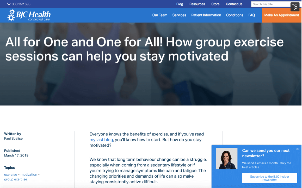
Apart from the offer and the positioning of the slider, the other thing that we did that really helped with conversions was to include a picture of a real person next to the form.
When a face appears next to a form or near a call-to-action, a couple of fascinating things come into play.
- Firstly, humans are hard-wired to look at faces, so the face attracts and keeps the visitors attention much more so than a picture of an eBook.
- Secondly, is to do with trust. Everyone when they’re completing a form has a tiny bit of uncertainty. What will happen when I fill this out? The face of a real team member answers that question.
The Results
As a result of these two changes the subscriber growth took off and increased by 3,900%. I know - astonishing and I quadruple-checked the math.
They are now regularly adding new subscribers each month and it’s gathering momentum, where previously they would only gain one or two new subscribers each month.
The beauty of this approach is that it proves that running experiments and taking a softer approach, rather than in-your-face pop-up forms, is a better strategy for long term growth.
How about you give it a try? I’d love to know how you get on.
